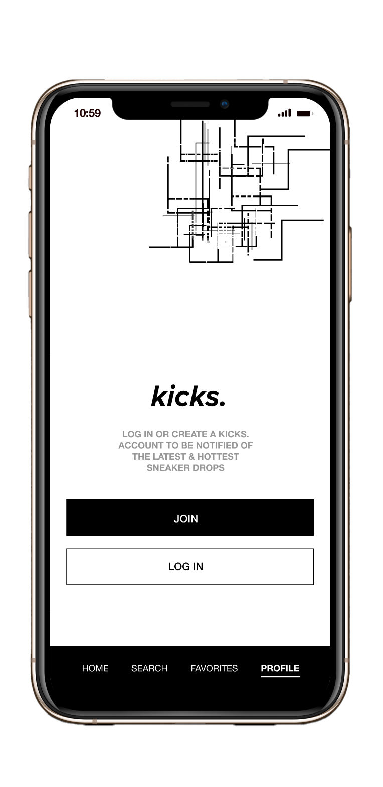
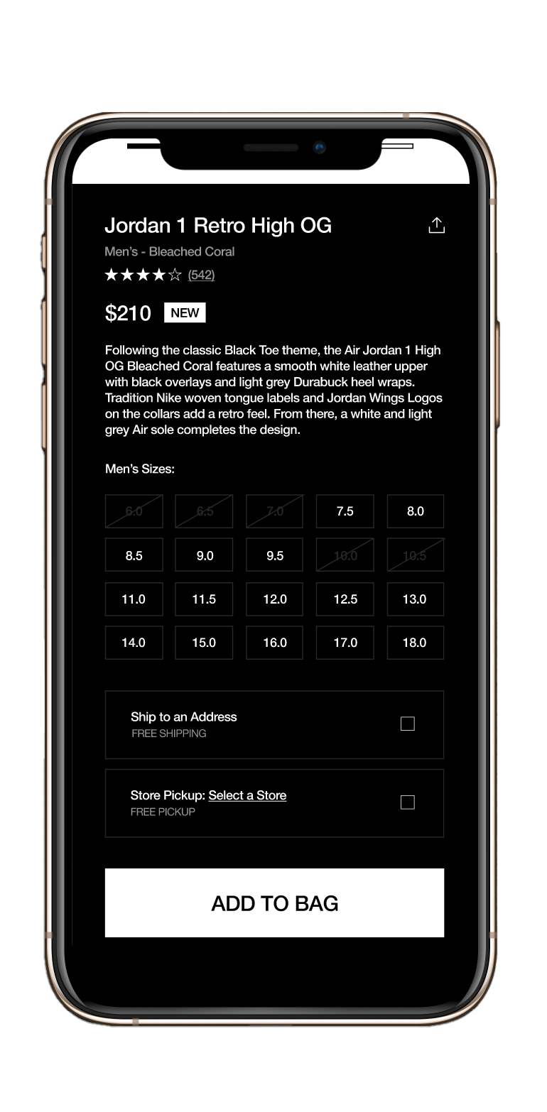
The title of this application is kicks. Kicks is a mobile application designed to purchase, browse, and filter through a wide range of sneakers. The design of this application is intended to have clear usability for any user, whether they are new or old. With this simple and organized structure, users are effectively able to navigate and complete tasks throughout the application.
FINAL CONCEPT
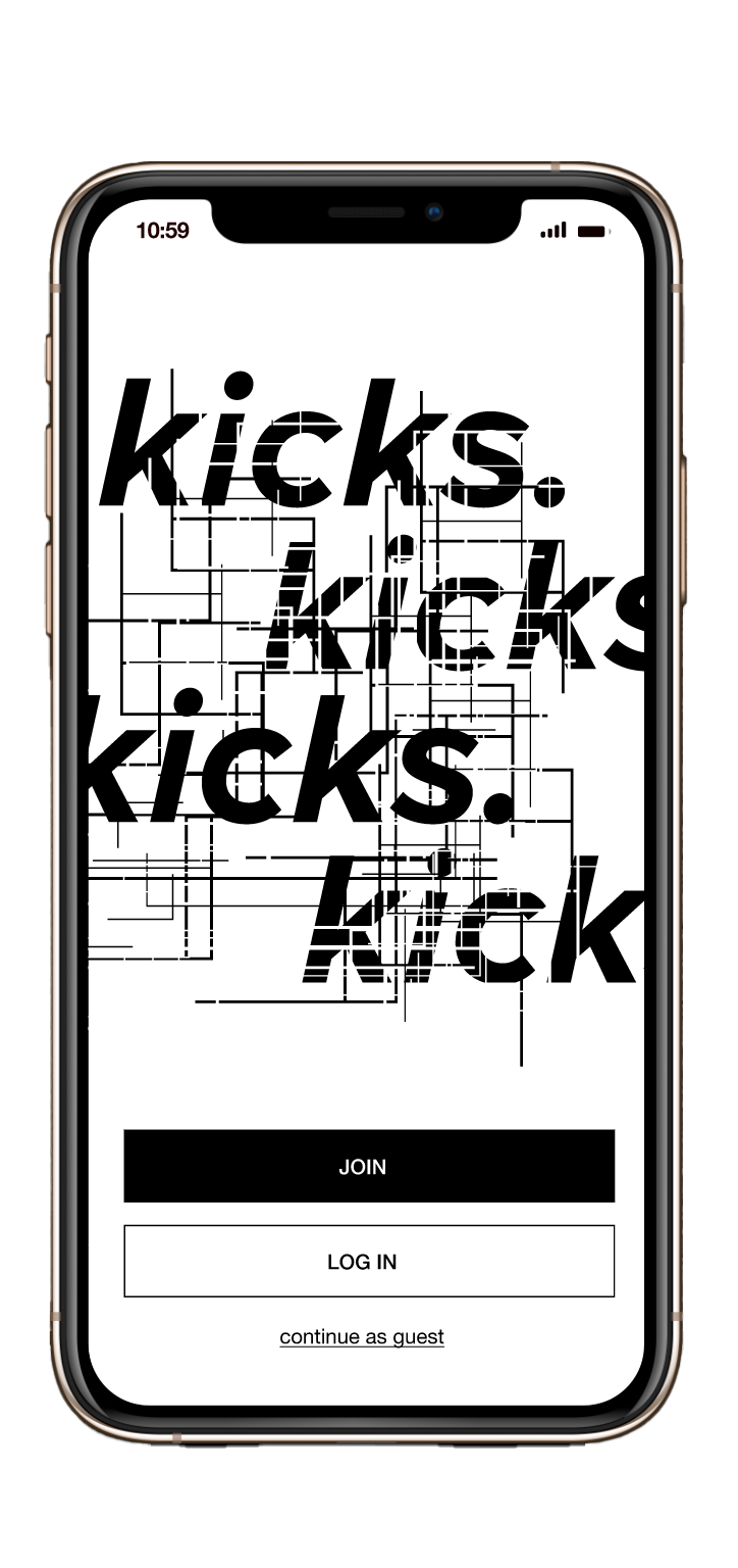
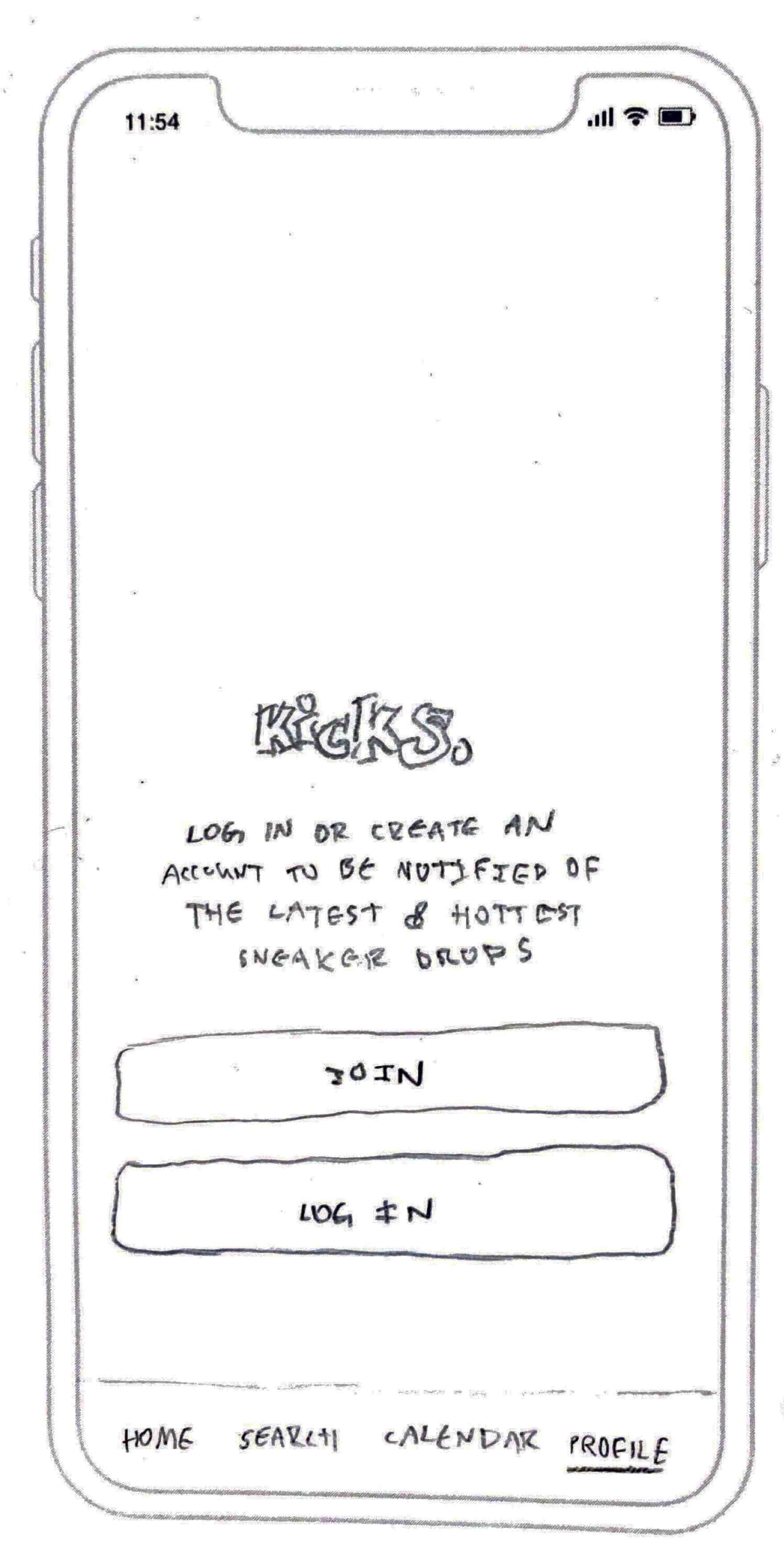
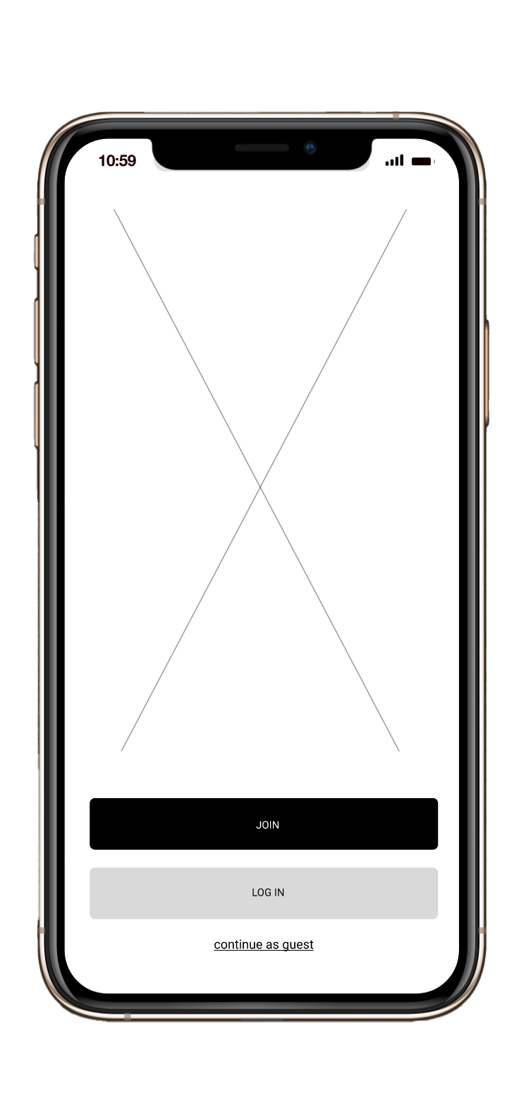
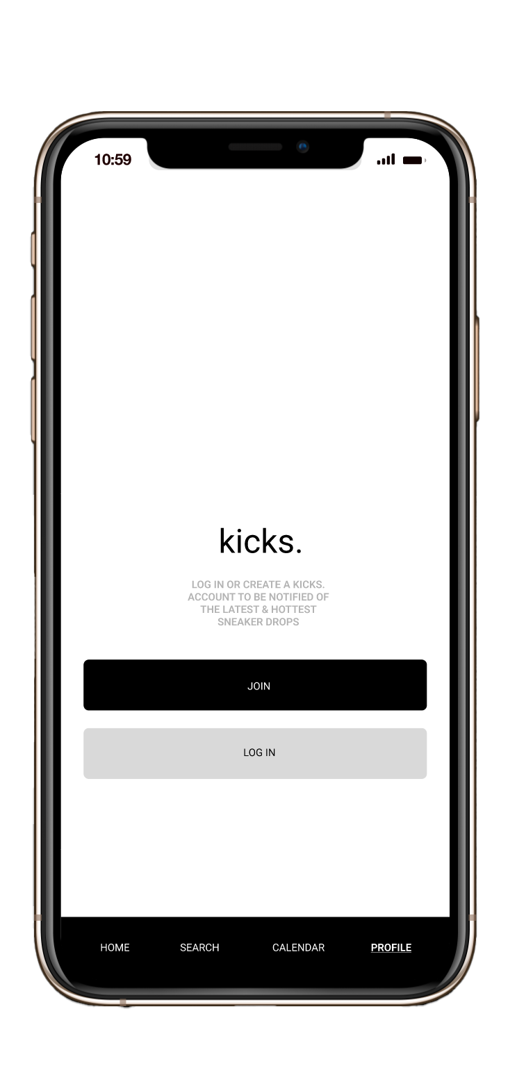
Join/Log In

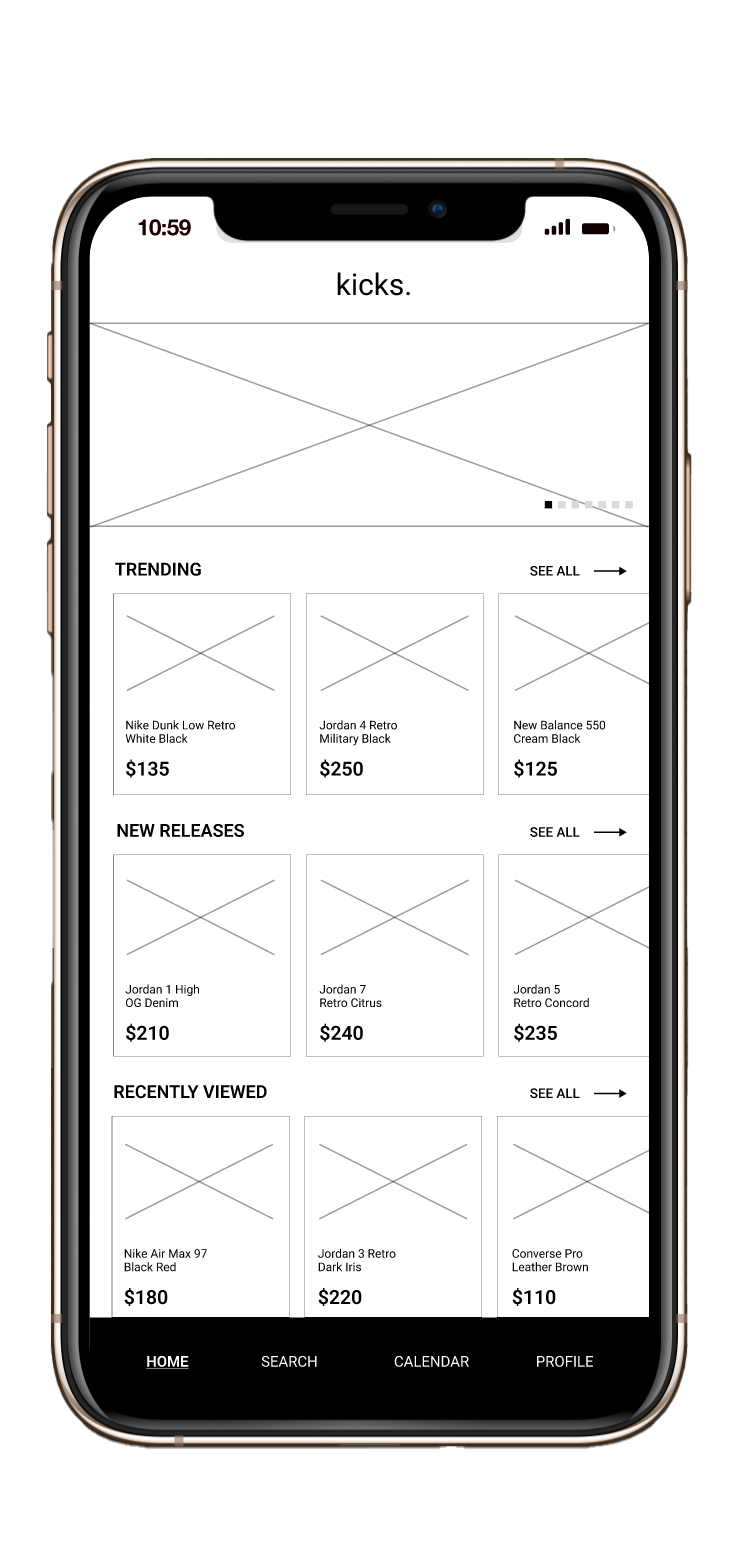
Home
Shoe Info
PROCESS
To began this project I developed two different task flows to help navigate myself as I designed screens for this app. Using the task flows, and wireframes I created later on, I conducted two user tests with two separate people, which allowed me to get a better understanding of how people would navigate my app if they had saw it for the first time. Here below is the first user task flow and test, which deals with entering the app and navigating to the search bar.

User Task Flow A
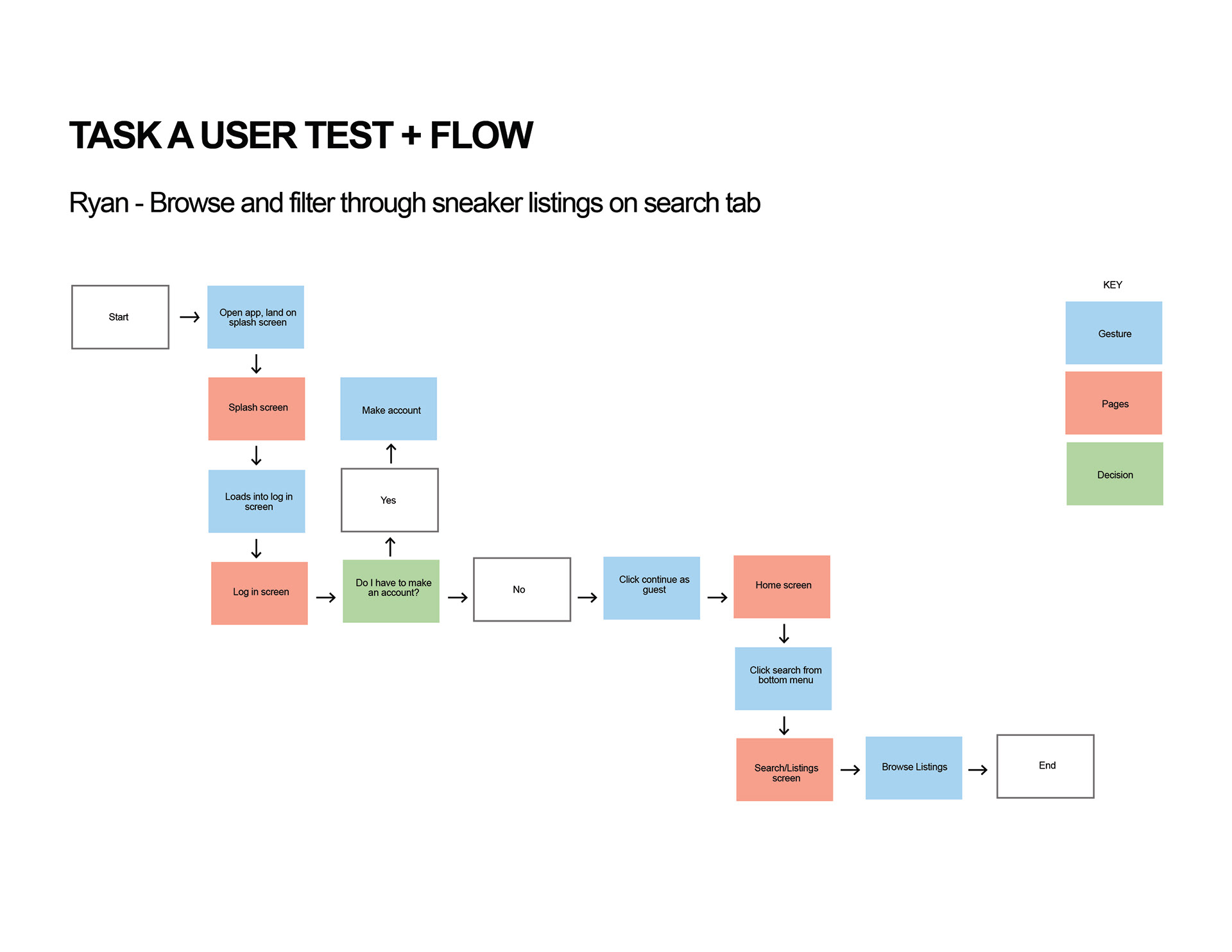
User Test A
The second user task flow and test is below. It is for a user that would enter the app and navigate to the calendar to view upcoming releases of new sneakers. However, later on in the process of this app creation, I found this task unconvincing in which I changed the task to create a "kicks" profile instead.
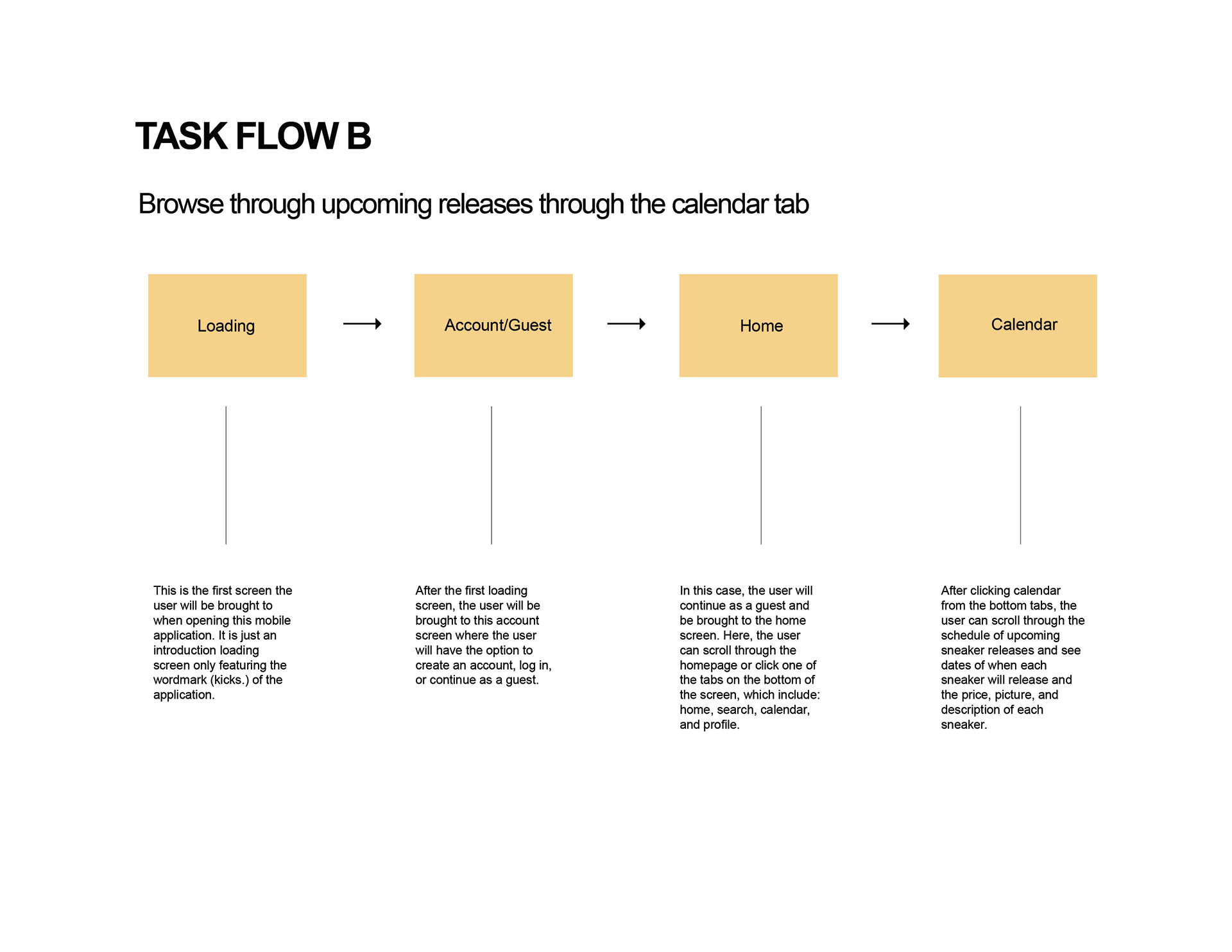
User Task Flow B

User Test B
After conducting user tests and receiving feedback, I began to lay out all of the pages that would be included in my app to ultimately create this information architecture below:
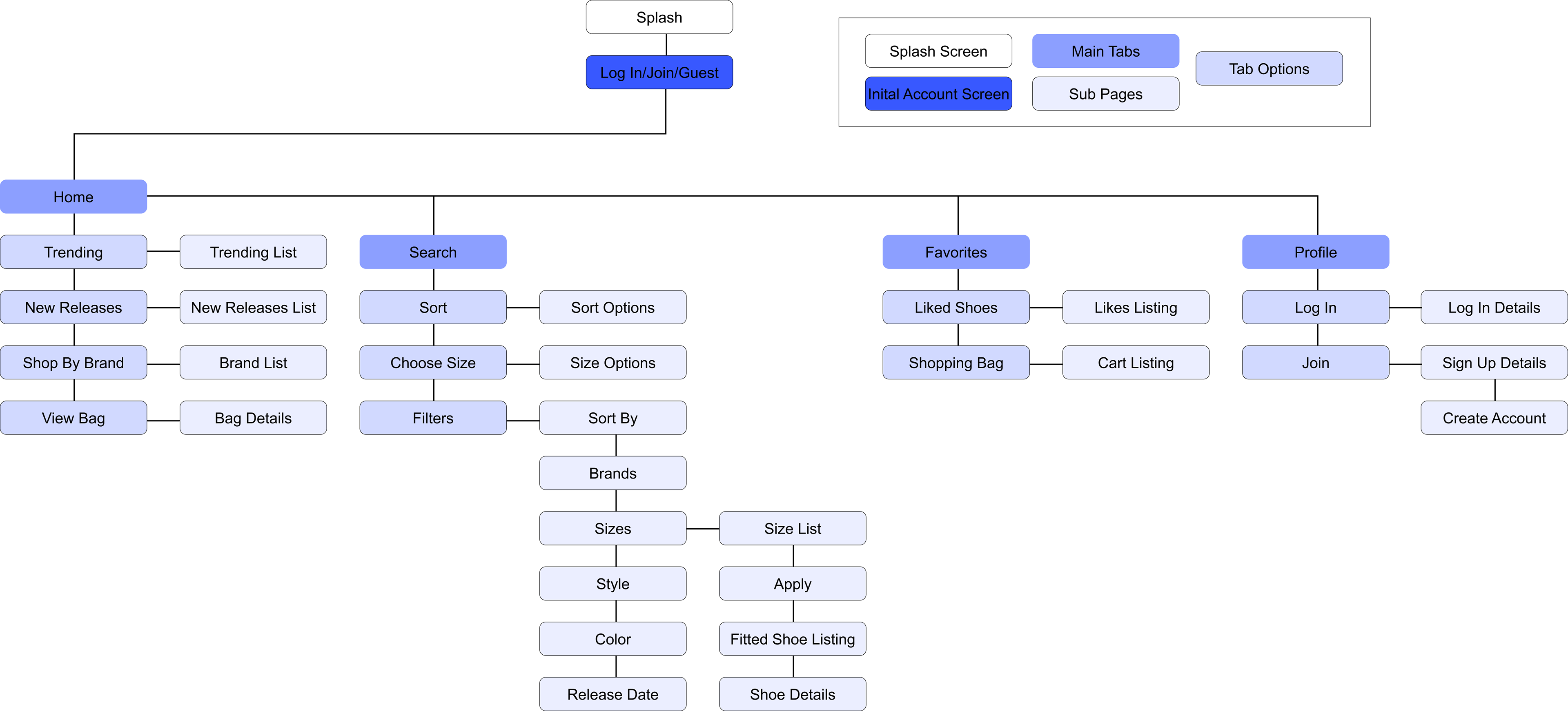
Information Architecture
Next, using my information architecture as a guide, I started sketching out screens a part of my task flows to create this paper prototype below:

Sketch #1

Sketch #2

Sketch #3

Sketch #4
Sketch #5
From my paper prototype above, I received constructive feedback, which aided my process further into creating this higher fidelity wireframe below:
Wireframe #1
Wireframe #2
Wireframe #3

Wireframe #4
Wireframe #5
At this point I had a pretty clear idea of the general navigation, usability, and layout of my app. However, I needed a design and color system to follow so I put together two separate mood boards.
Direction A to the left involves a red/white/black color palette for a relatively sophisticated or “serious” mobile application dedicated to sneakers. This specific direction would feature a simple, cohesive, and familiar design being high in contrast to ultimately design the most effective application to purchase or browse sneakers on a mobile device.
Direction B to the right involves an assortment of playful and vibrant colors. Compared to the first mood board, this direction would be less uniform with more freedom regarding colors, icons, and overall design. Additionally, this design would feature more colored shapes, illustrations, and other fun design elements.
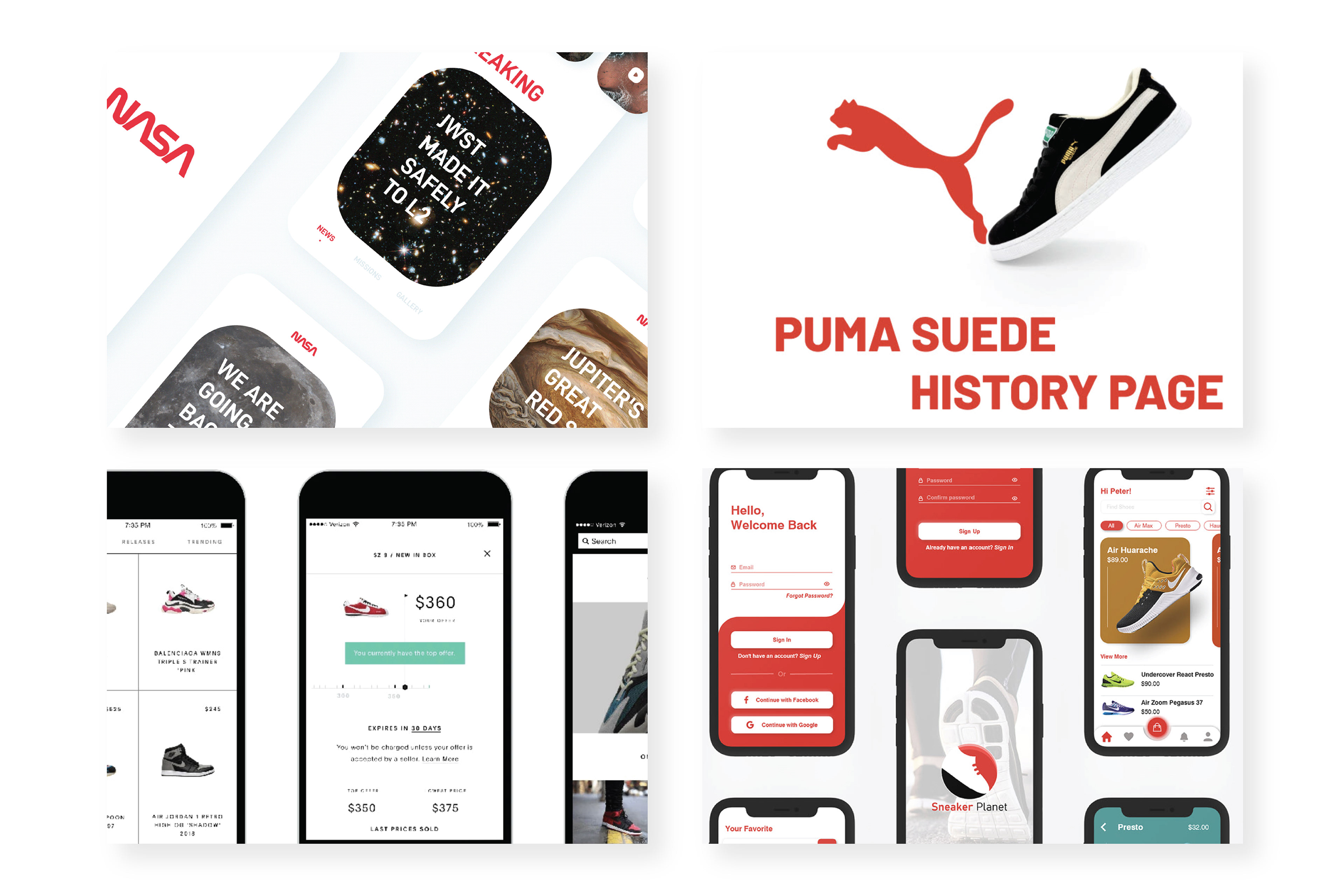
Mood Board A

Mood Board B
As I moved forward, I leaned towards Direction A, however with a completely grayscale color palette combined with sharp, squared, and geometric design elements. I first created the style guide shown here.
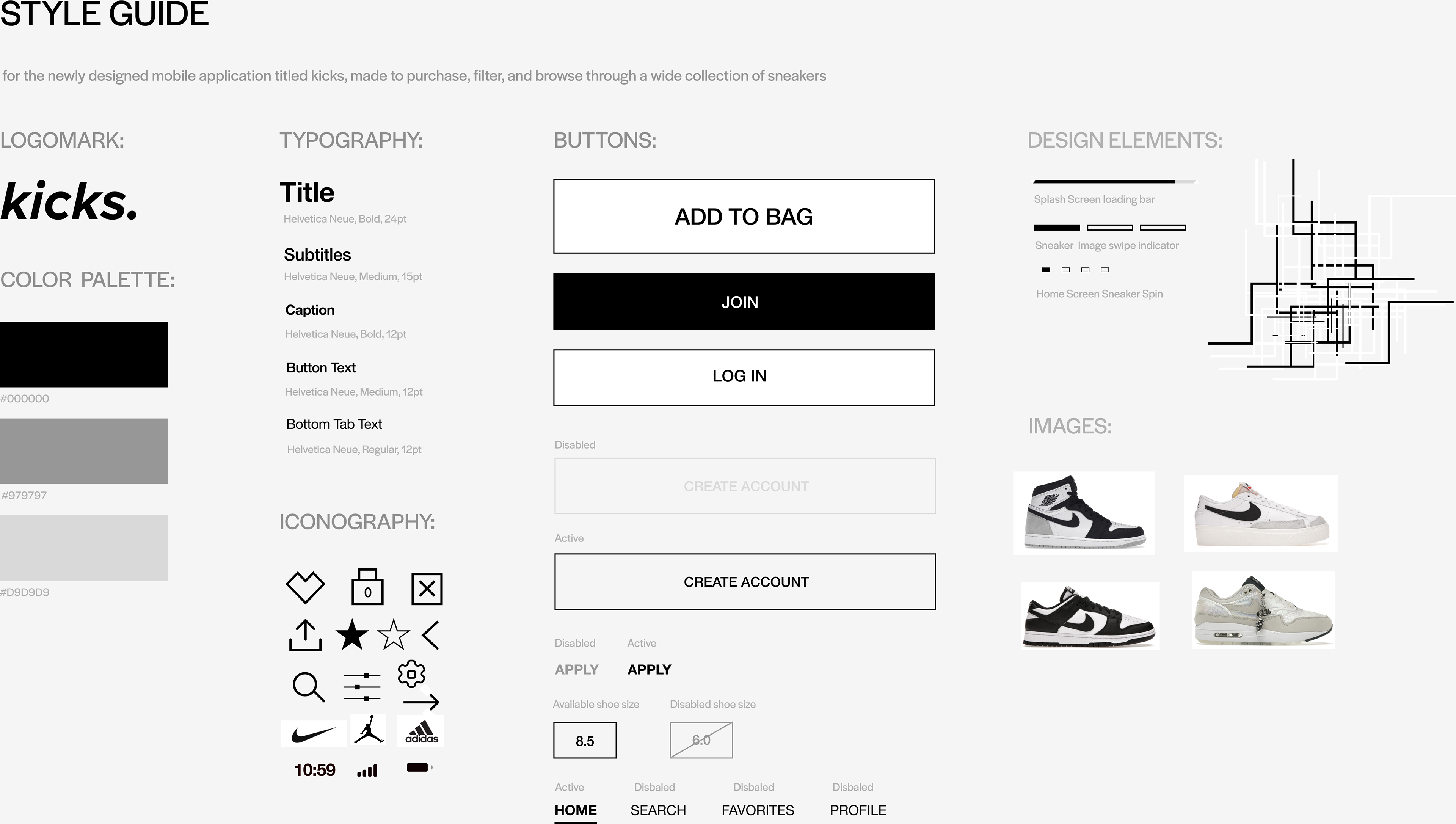
Style Guide
ADDITONAL FINAL SCREENS
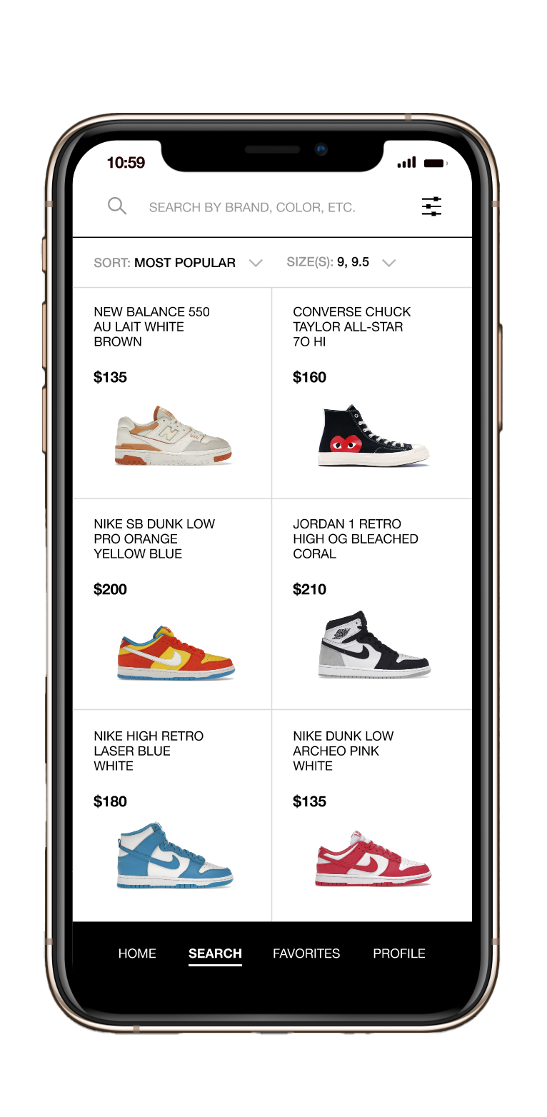
Filtered Listing
Join/Log In
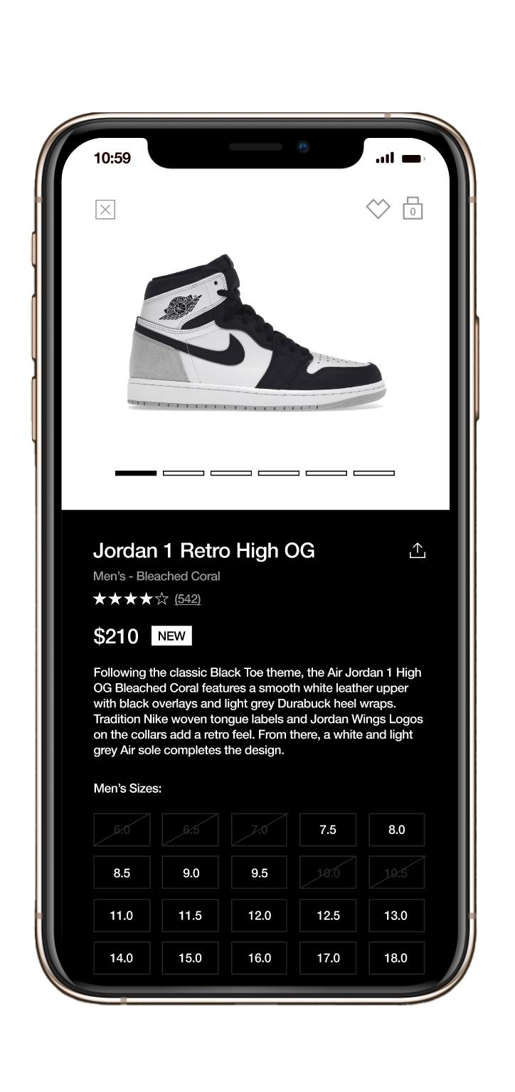
Shoe Info
To view the entire application concept and style guide, click the link below: