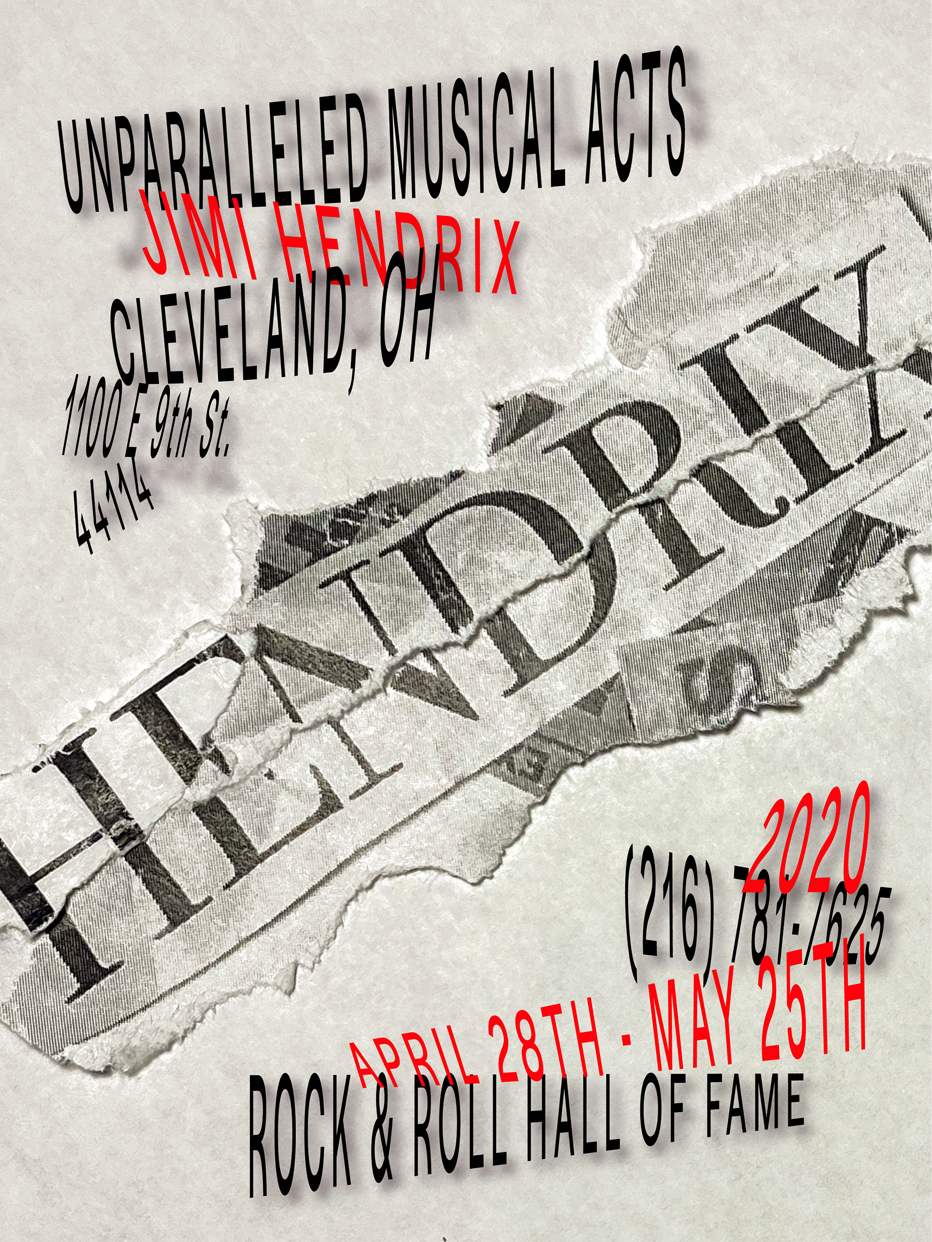
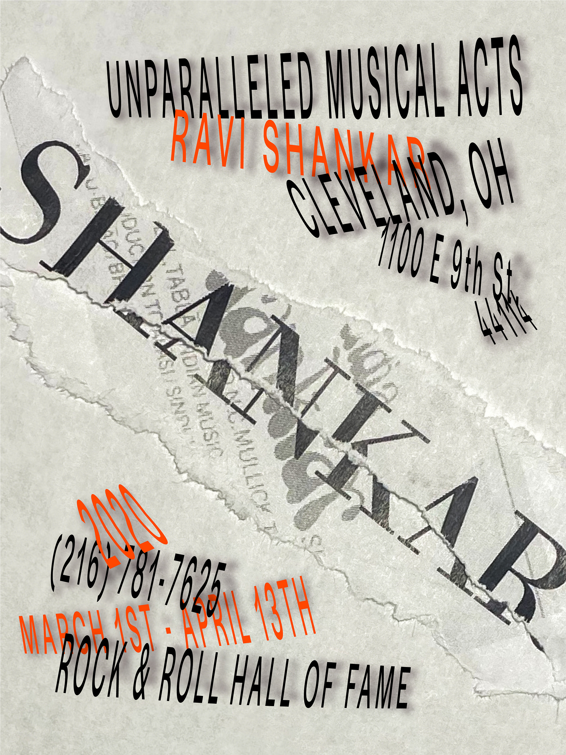
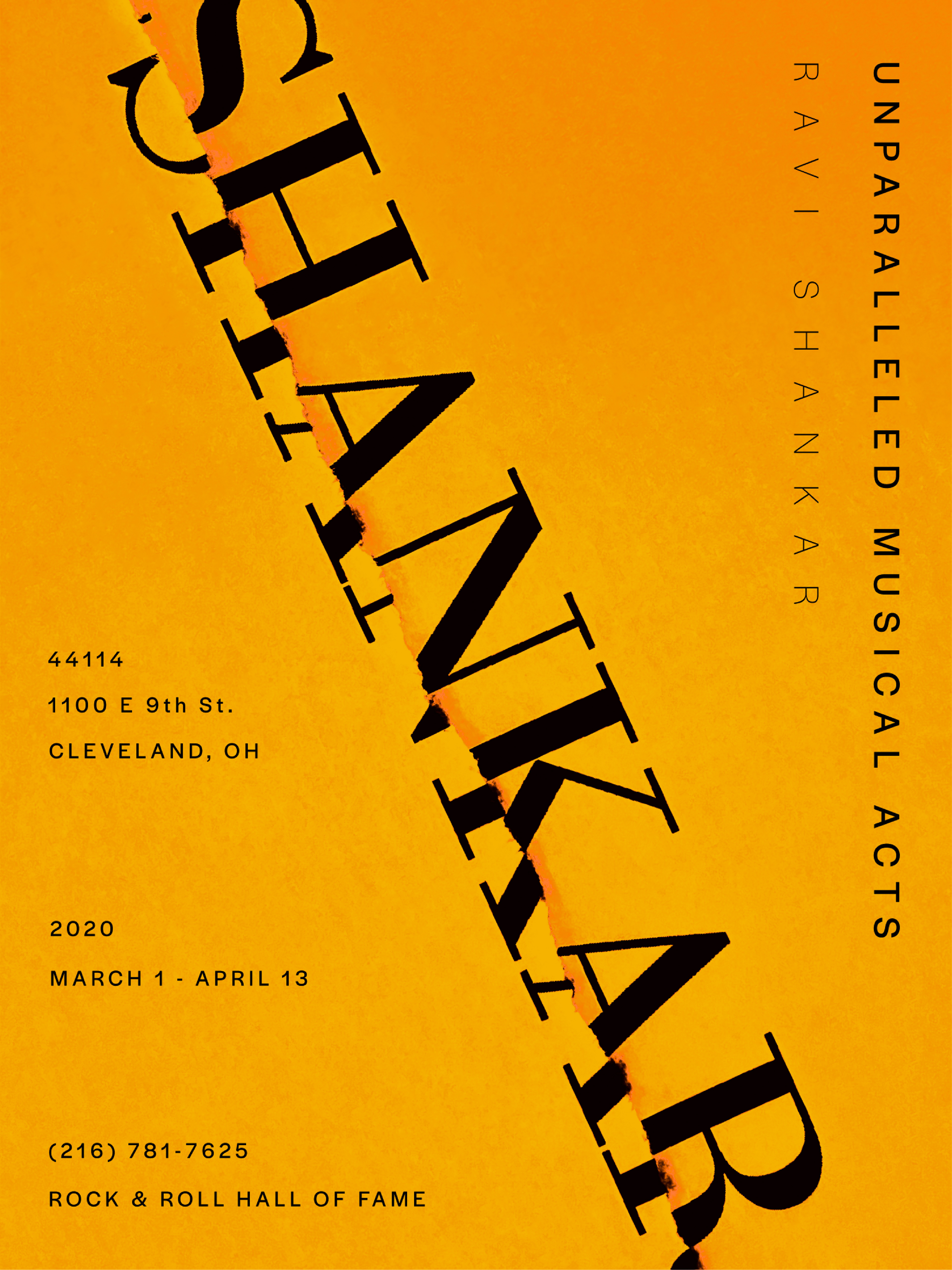
This project focuses on three different music icons: Jimi Hendrix, Ravi Shankar, & Madonna. I was tasked to create a series of three separate, experimental, and cohesive posters with each one focusing and giving life to its respective music icon. The purpose of these posters are to promote and advertise an event at in which this case the Rock and Roll Hall of Hame.
FINAL SERIES

Final Poster (Jimi Hendrix)

Final Poster (Ravi Shankar)

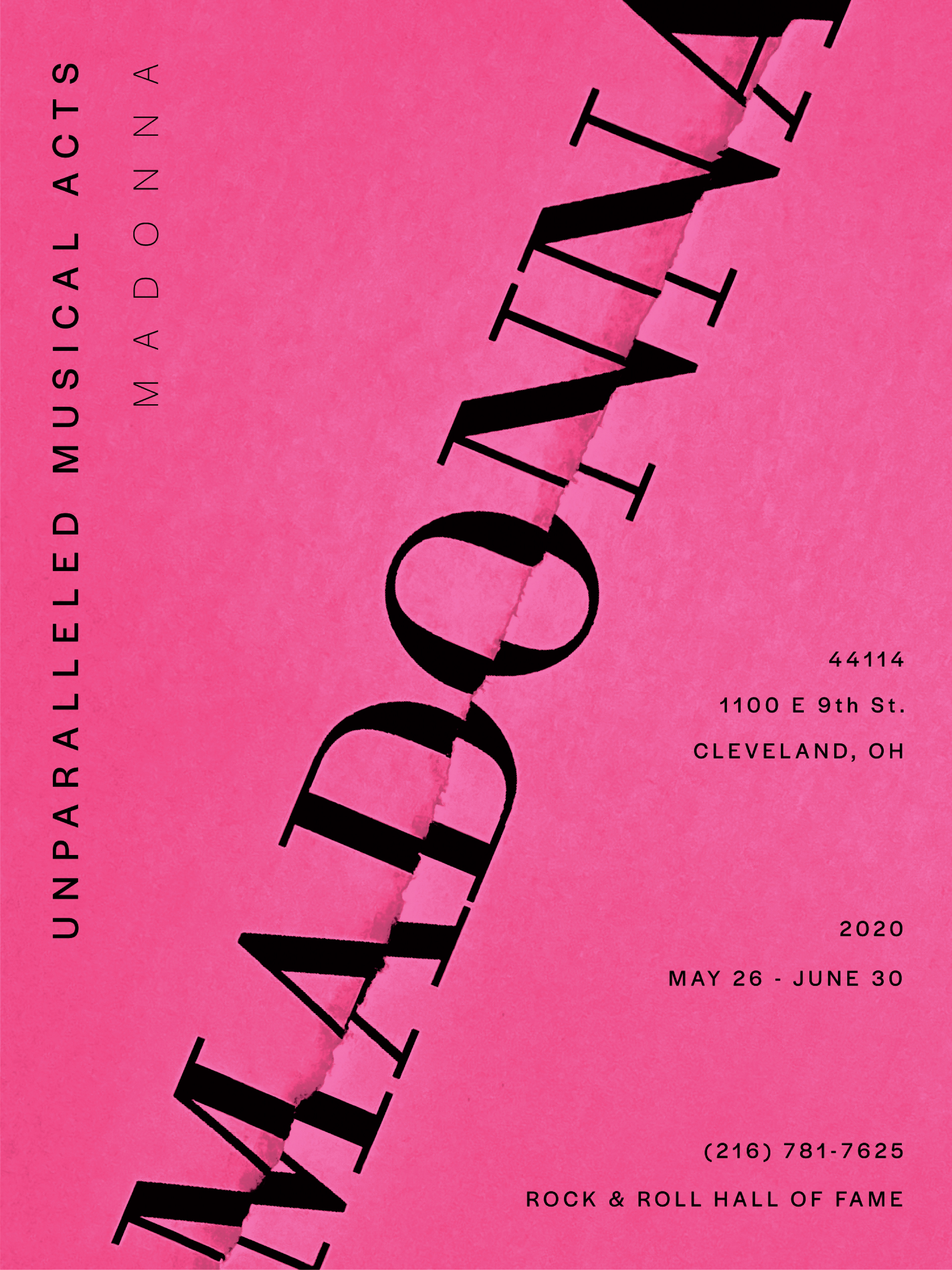
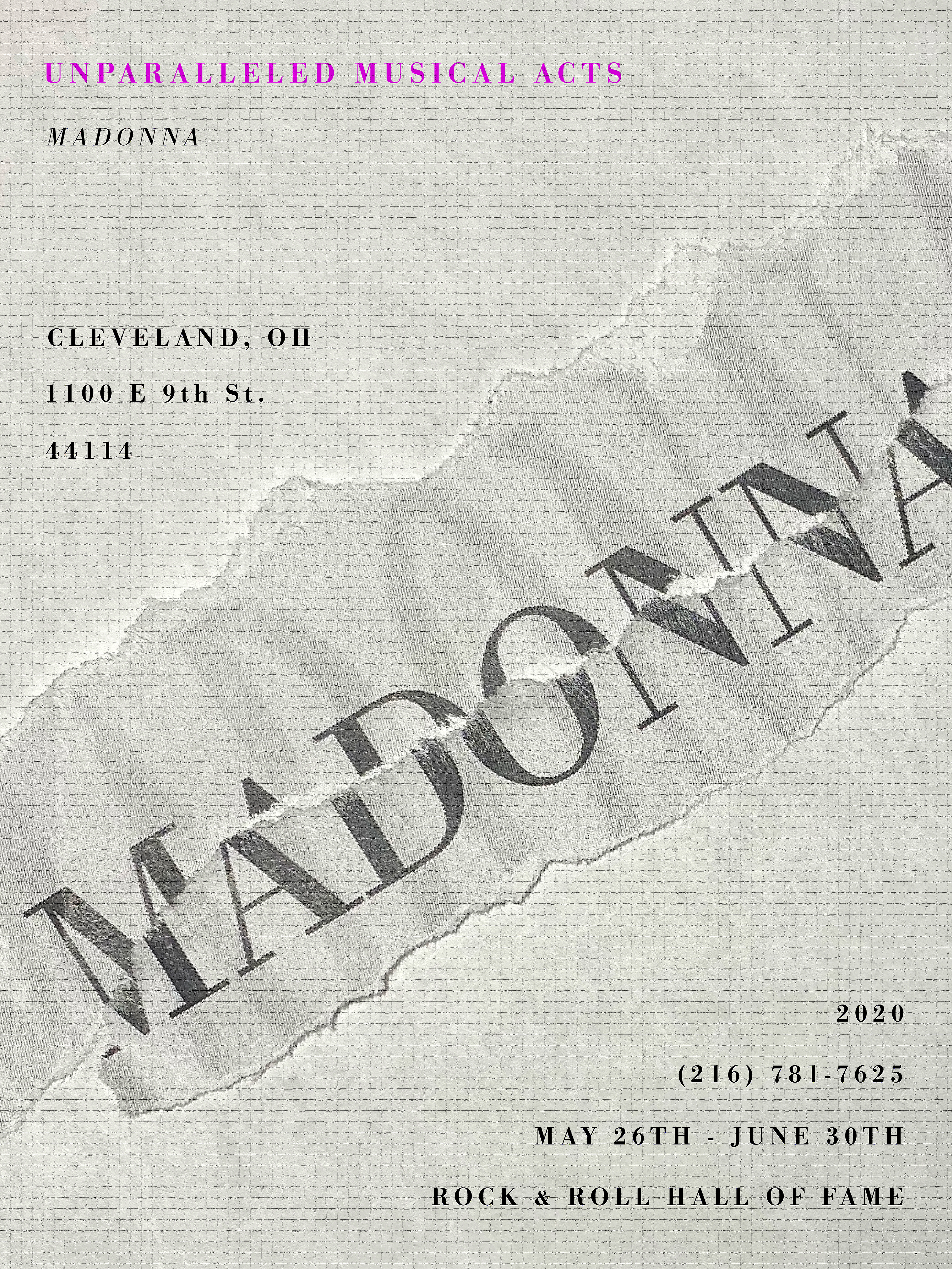
Final Poster (Madonna)
PROCESS
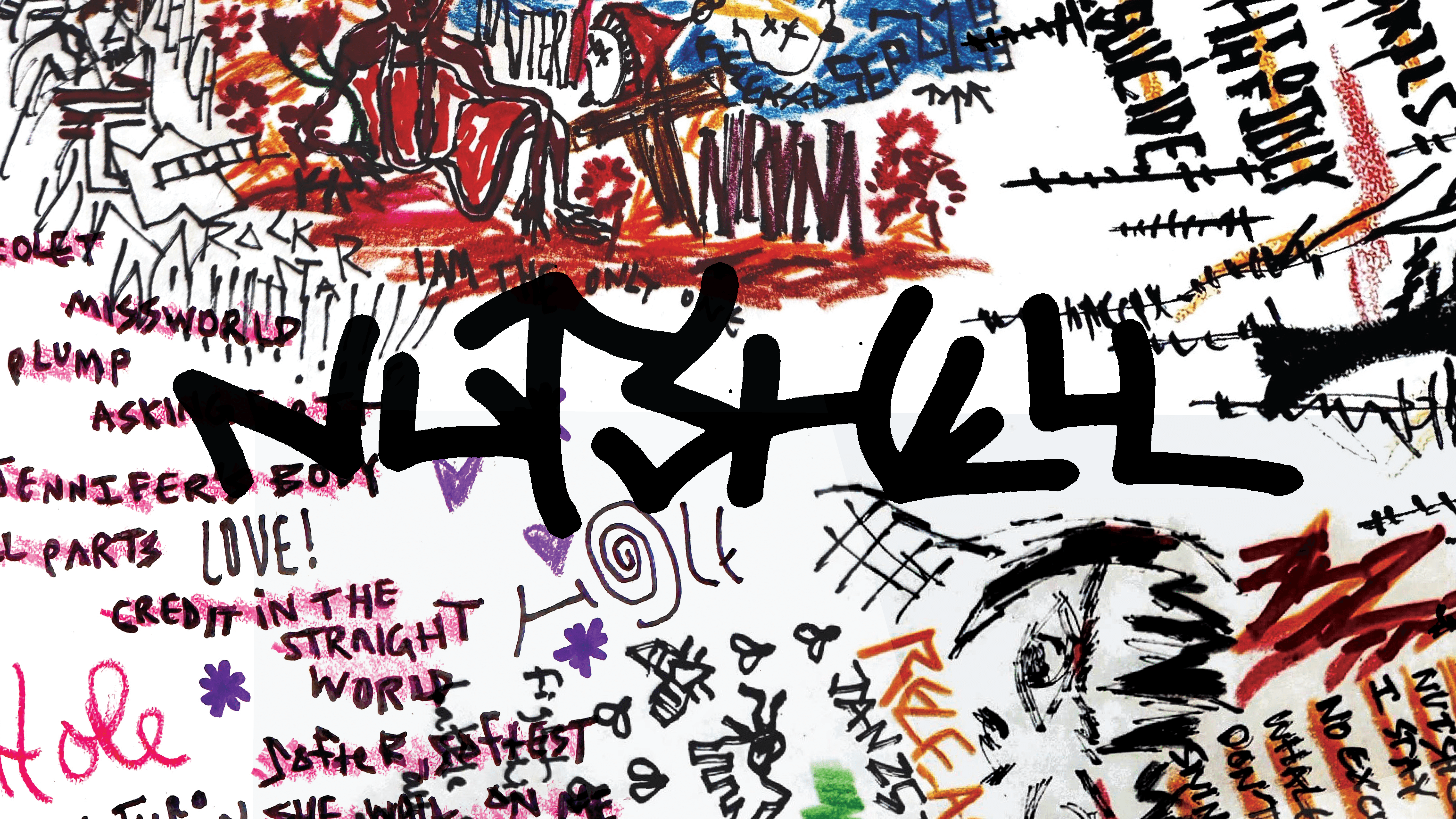
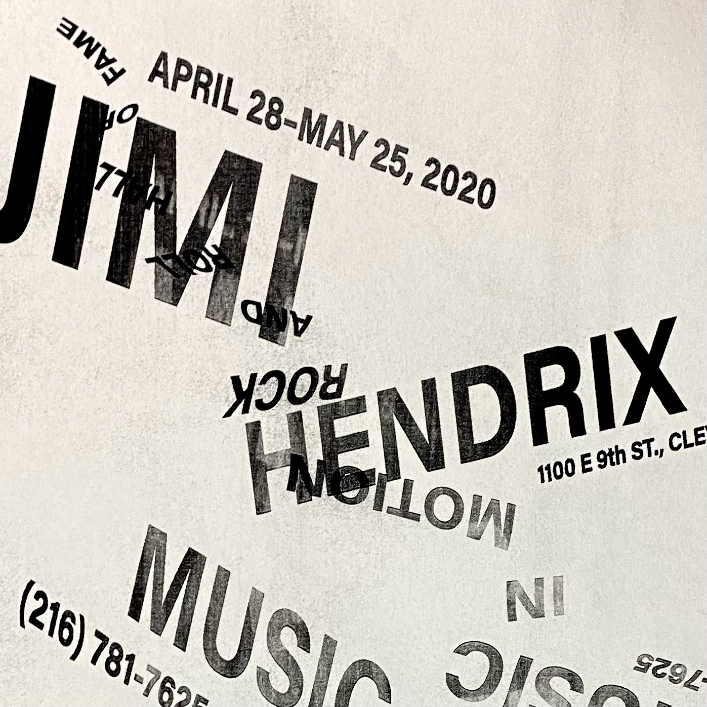
I began my process by distorting the type and letterforms used for the posters. By use of my printer, I copied and manipulated different pieces of paper to ultimately create these rough compositions below.

Process 1
Process 2
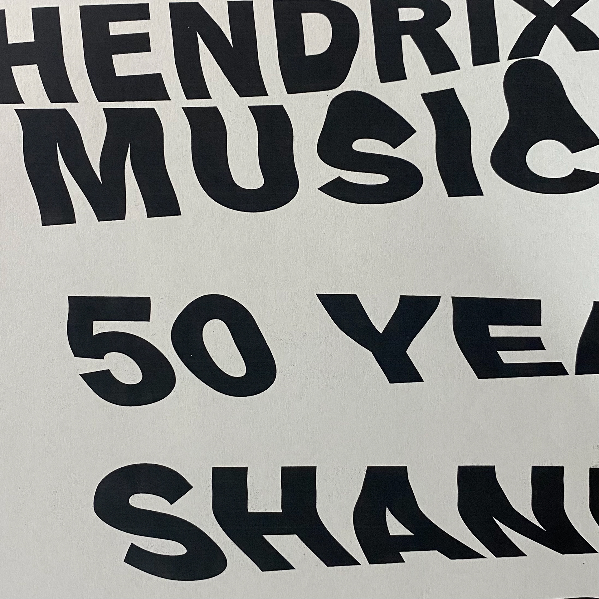
Process 3
As I moved forward through my process, I came to the decision that I would have my poster series involve some sort of torn paper with the presence of inversion. Below is my first complete series I created with the use of torn newspaper and type.

Iteration 1 (Jimi Hendrix)

Iteration 1 (Ravi Shankar)

Iteration 1 (Madonna)
Next, instead of just limiting myself to printed type, I attempted to combine the posters with digital type to create some separation, balance, and hierarchy.
Iteration 2 (Jimi Hendrix)
Iteration 2 (Ravi Shankar)
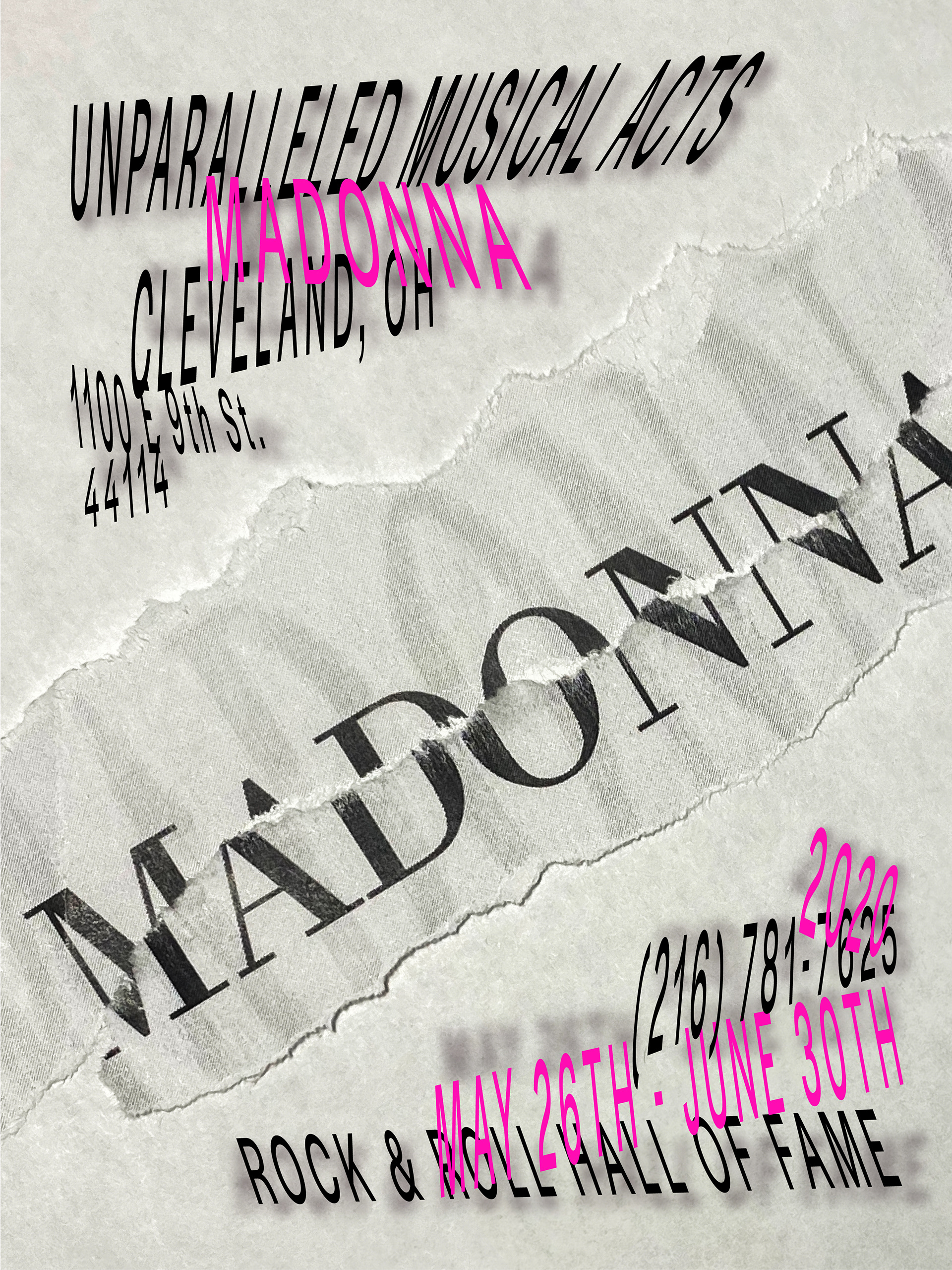
Iteration 2 (Madonna)

Iteration 3 (Jimi Hendrix)
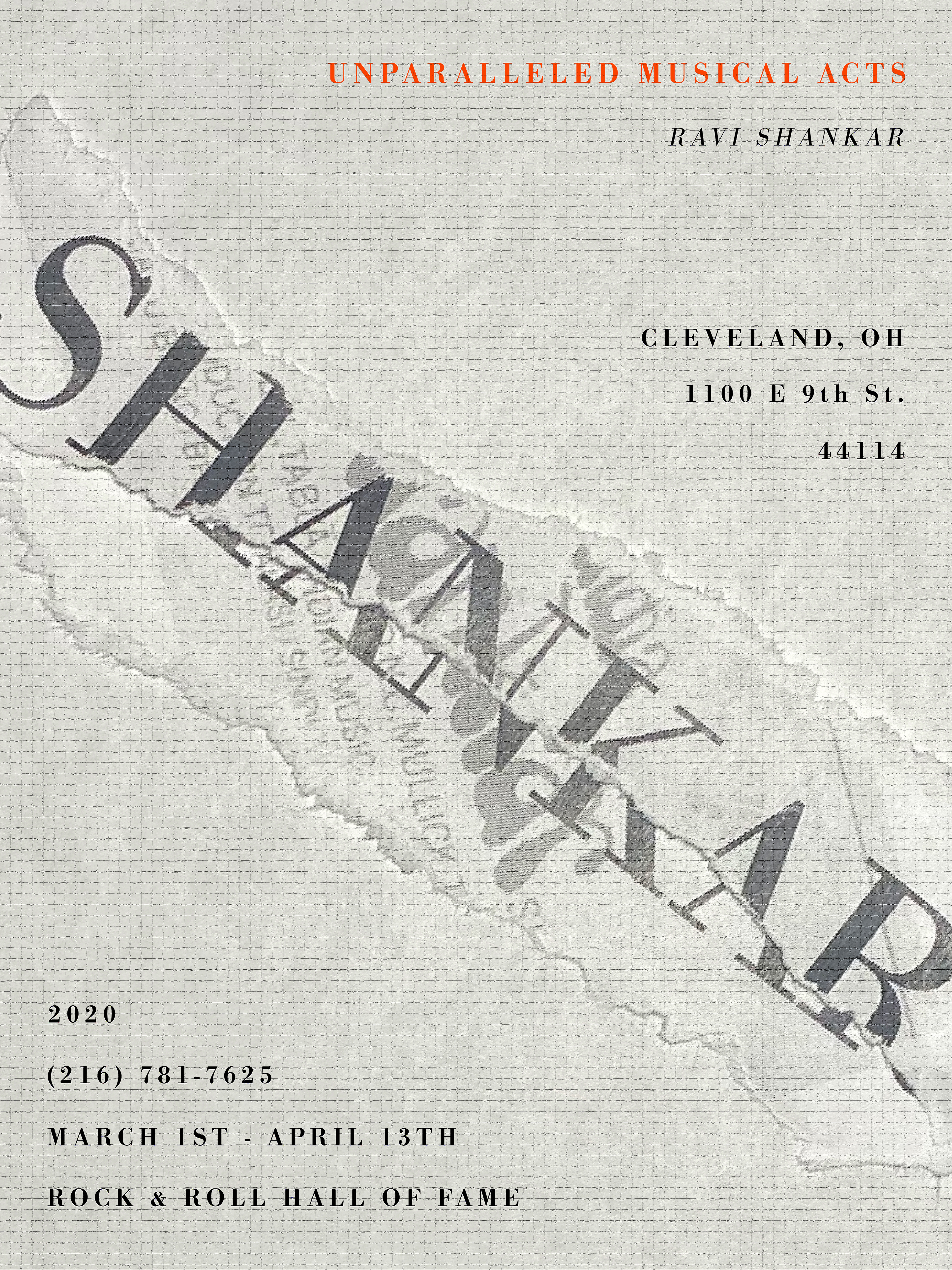
Iteration 3 (Ravi Shankar)
Iteration 3 (Madonna)
After making these three different series of posters above, I noticed something was off. There was too much competition regarding hierarchy and balance. Also, I realized these posters lacked vibrancy and energy.
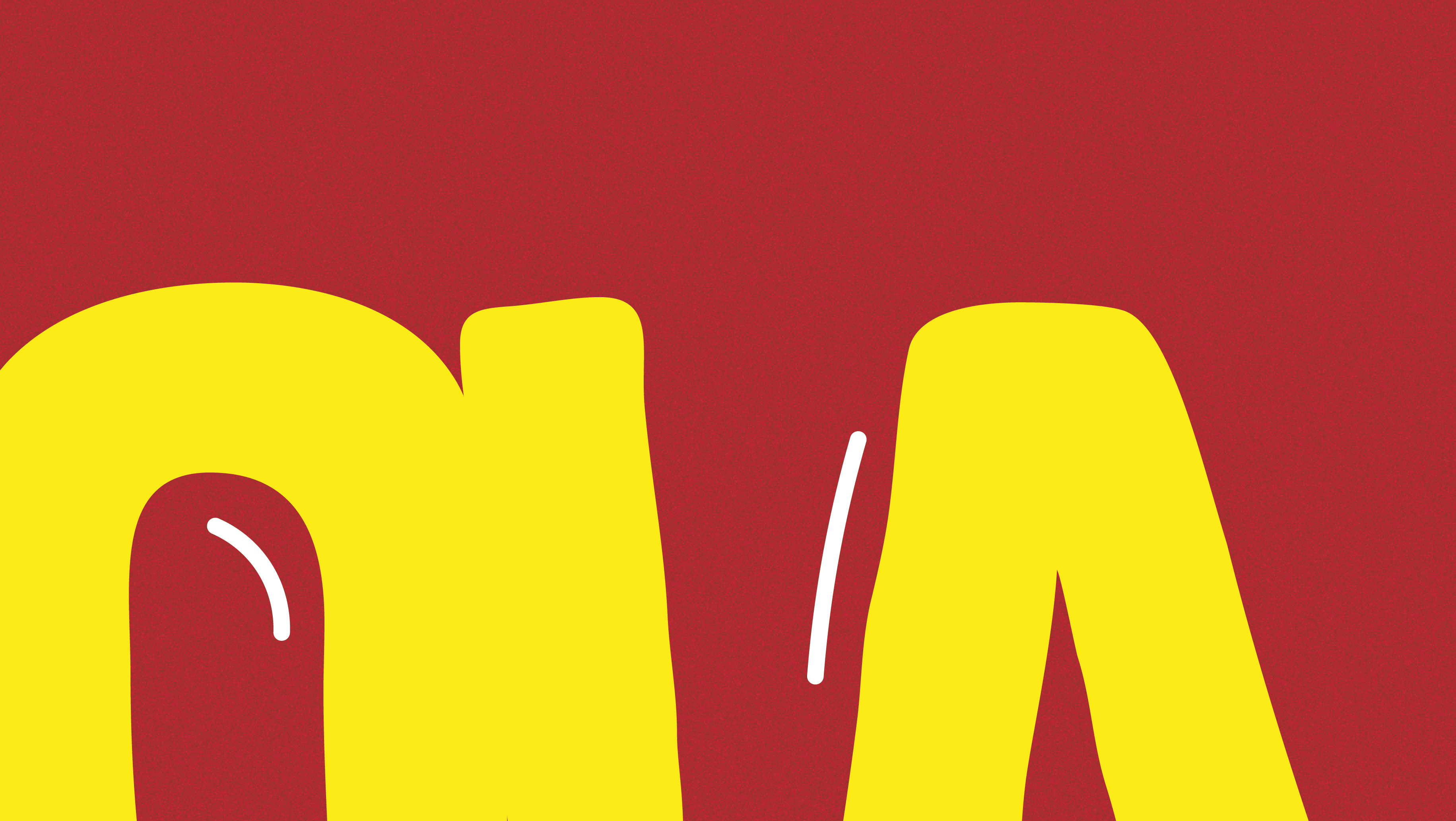
To solve this, I started from scratch, and began by increasing the contrast and size of what I decided to be the anomaly of my posters:

Final Outline (Jimi Hendrix)

Final Outline (Ravi Shankar)

Final Outline (Madonna)
For my final series below I added the event information and vibrant colors to give my posters a much more vivid and complete look.
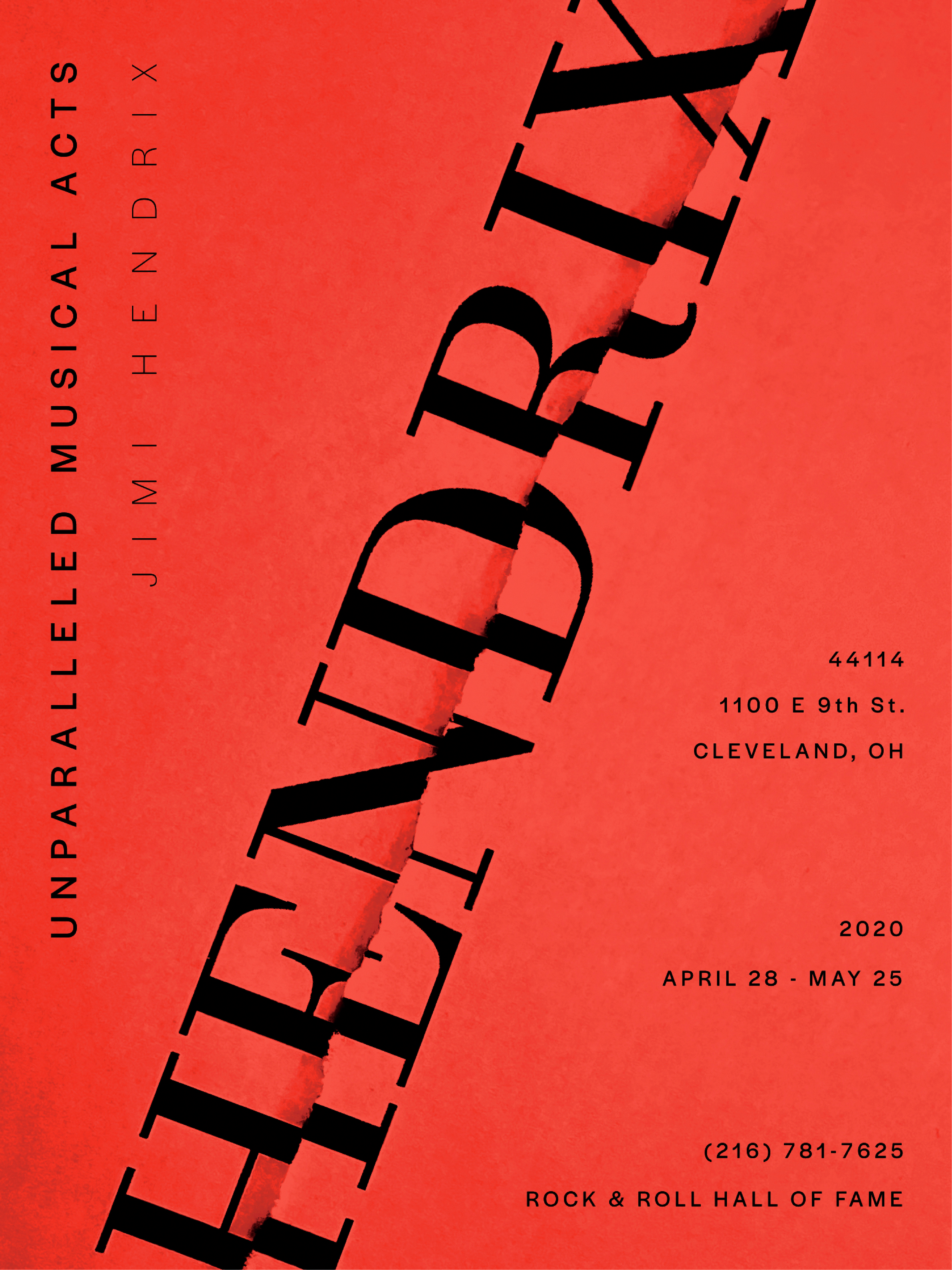
Final Poster (Jimi Hendrix)
Final Poster (Ravi Shankar)