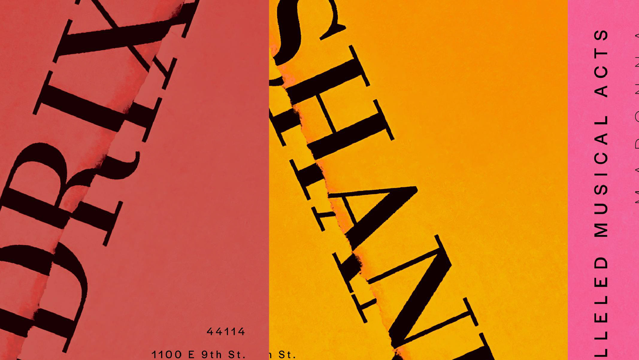
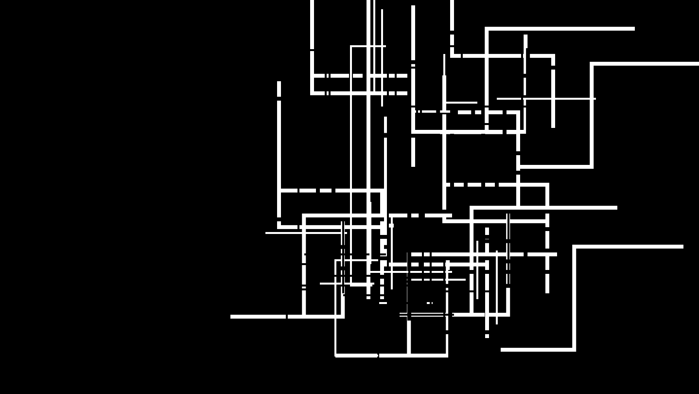
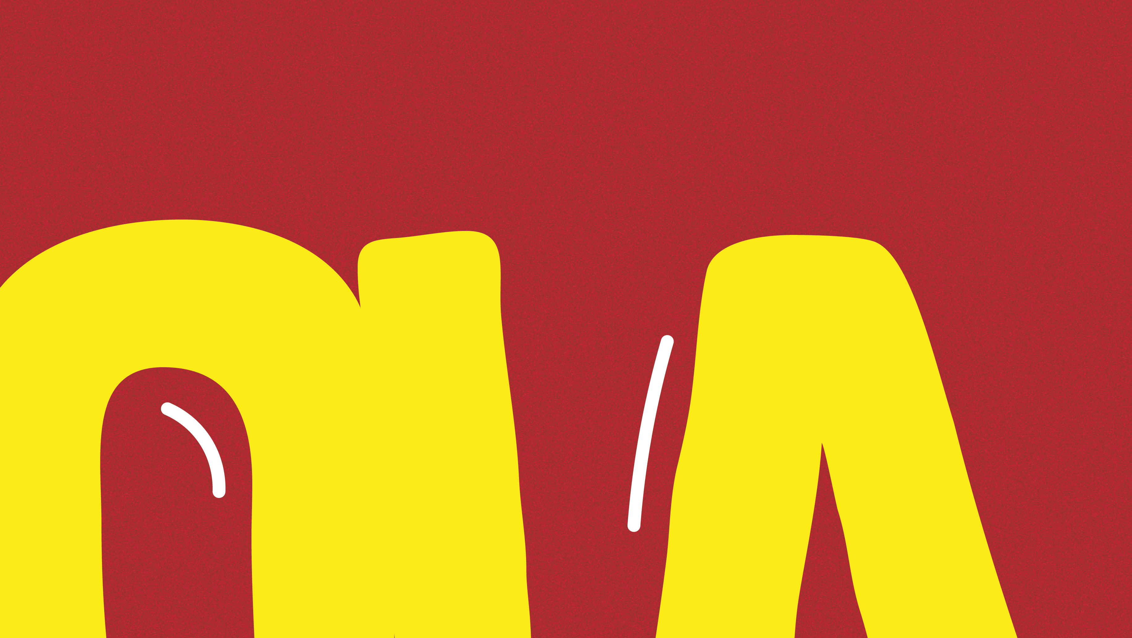
This is my personal project where I explored different ways in which I could visualize type and letterforms. In this circumstance, I redesigned a series of albums covers with a bit of a twist. I limited myself to just "Helvetica Bold" where I used just the letters of each album title to transform each cover to its original form in a minimalistic structure.
FINAL COVERS
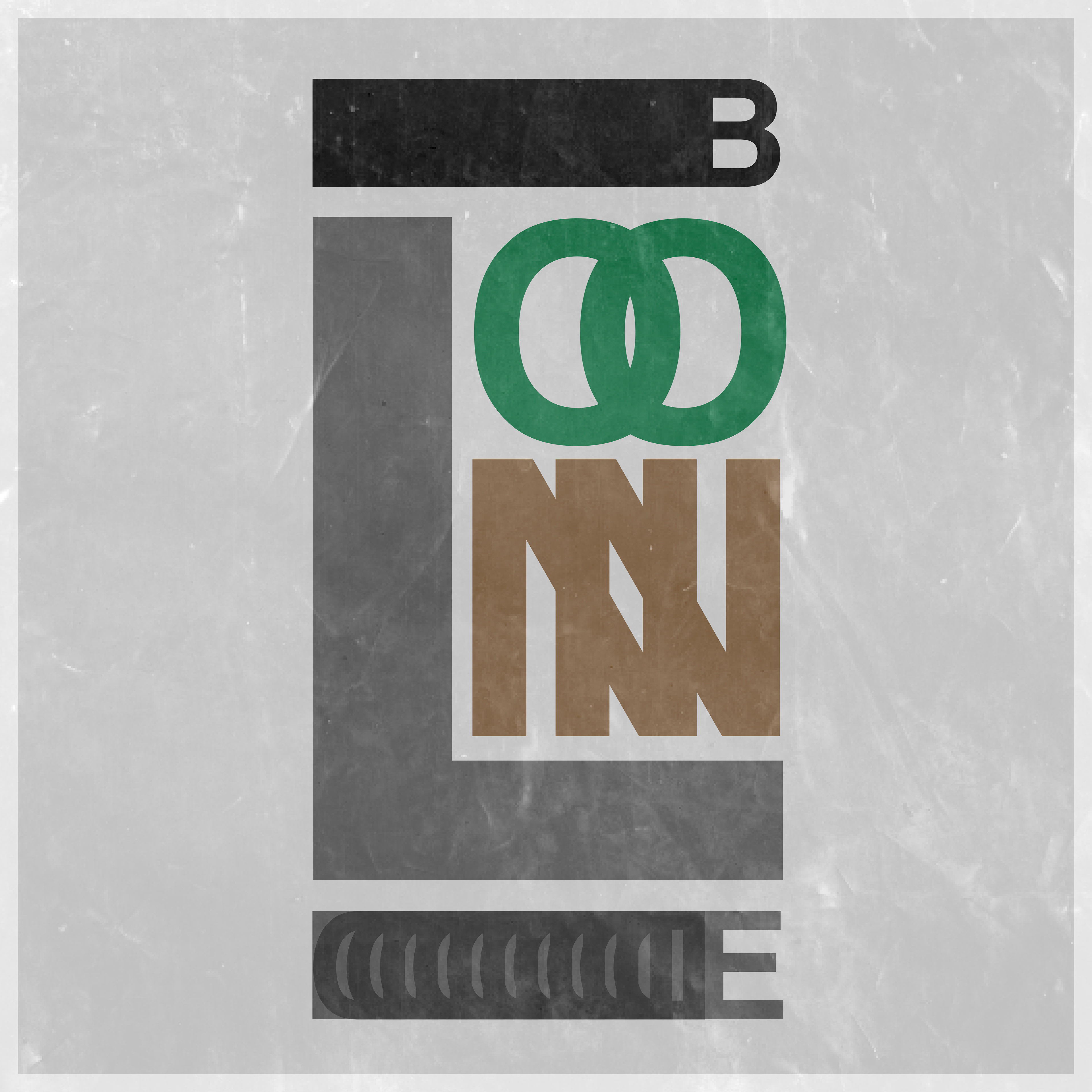
Final (Blonde)
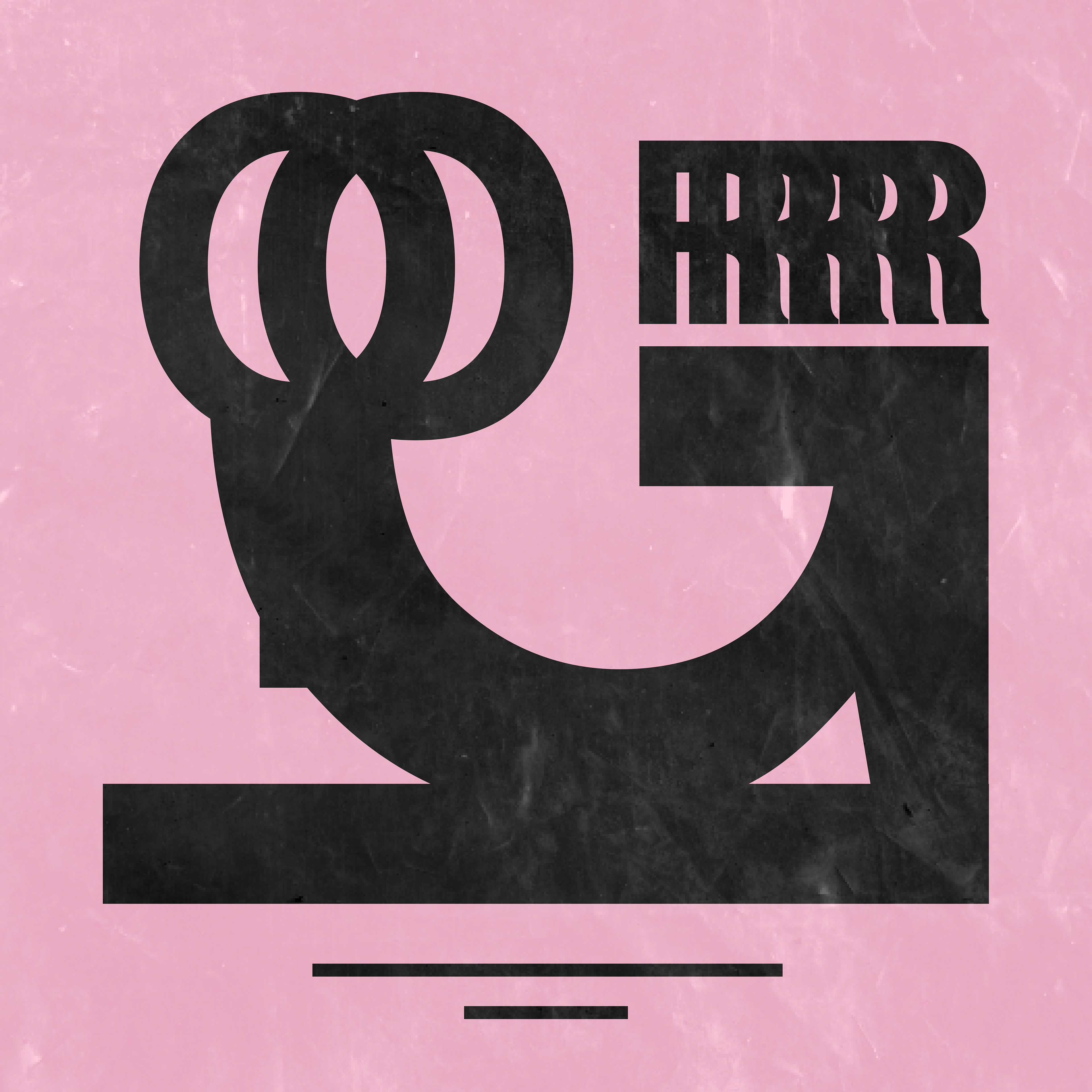
Final (Igor)
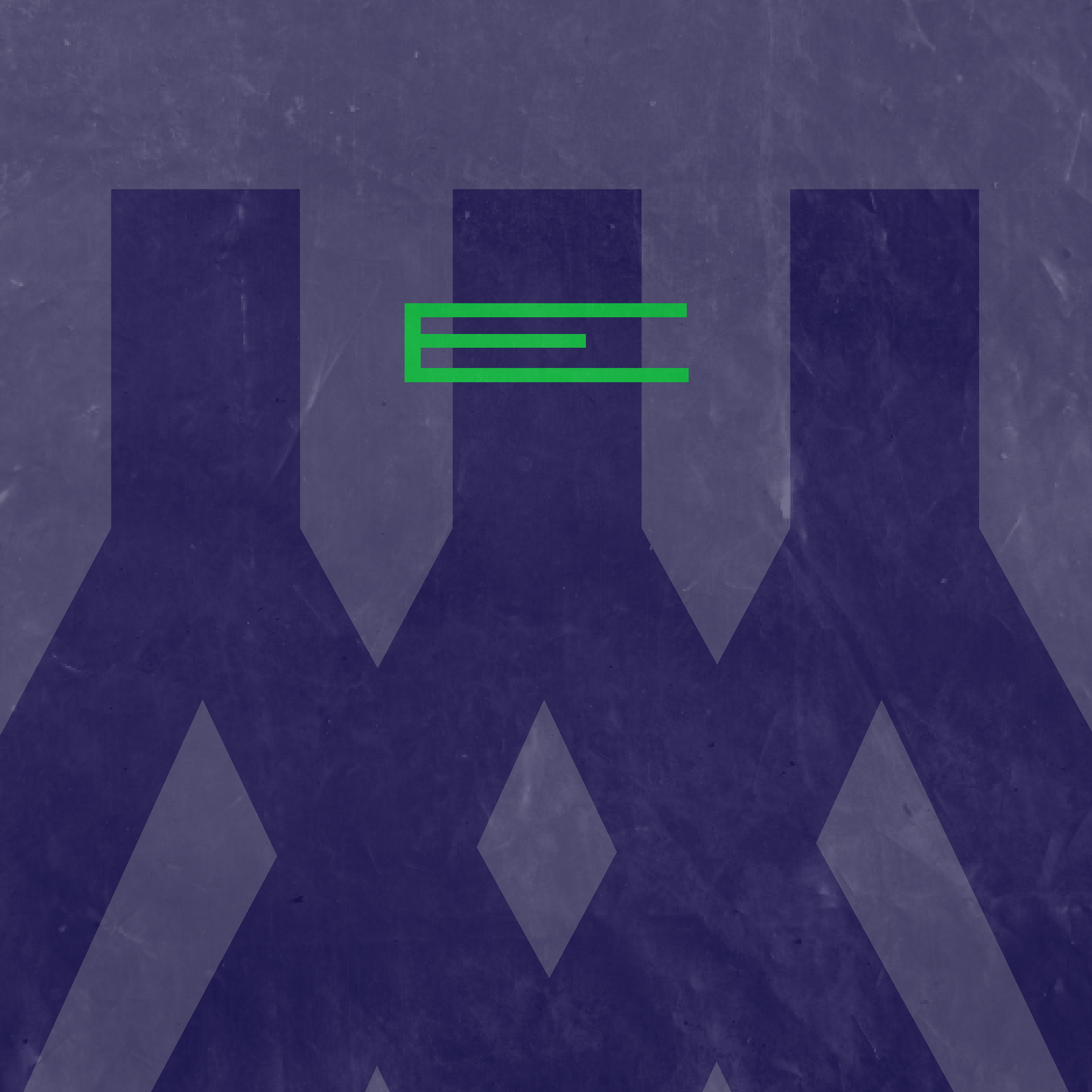
Final (Ye)
PROCESS
The process for this project began with sketches as I brainstormed and drew out any ideas that I thought I could benefit from. As you can see below, I developed rough blueprints of what I had in mind to create digitally.

Sketches (Blonde)

Sketches (Igor)

Sketches (Ye)
After sketching and having a better idea of what I wanted to move further with, I created these outlines below, which acted as the background color for each album cover.

Outline (Blonde)

Outline (Igor)

Outline (Ye)
Next, I began to add type digitally on top of the outlines. After much consideration, I ended up with the designs below.
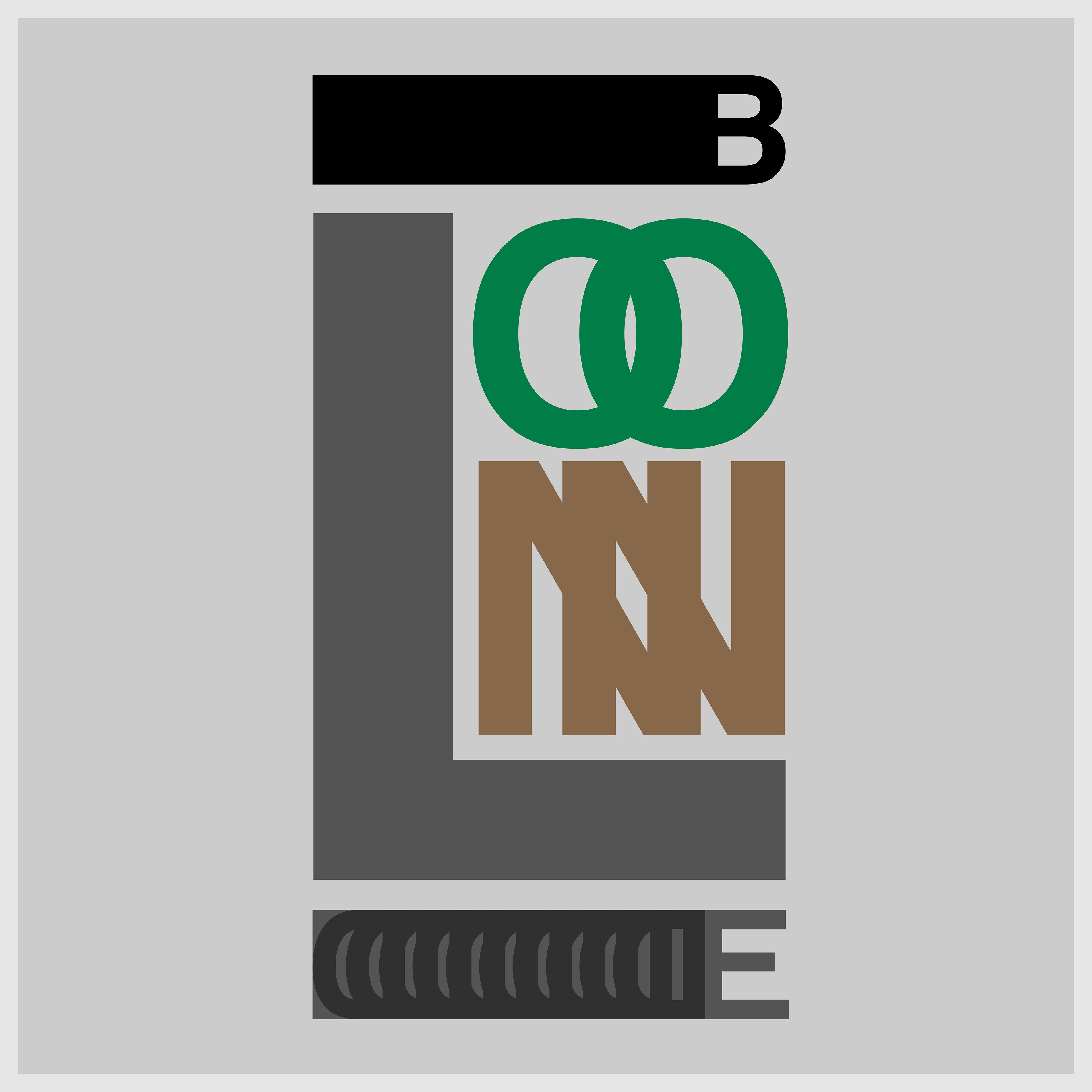
Layout (Blonde)
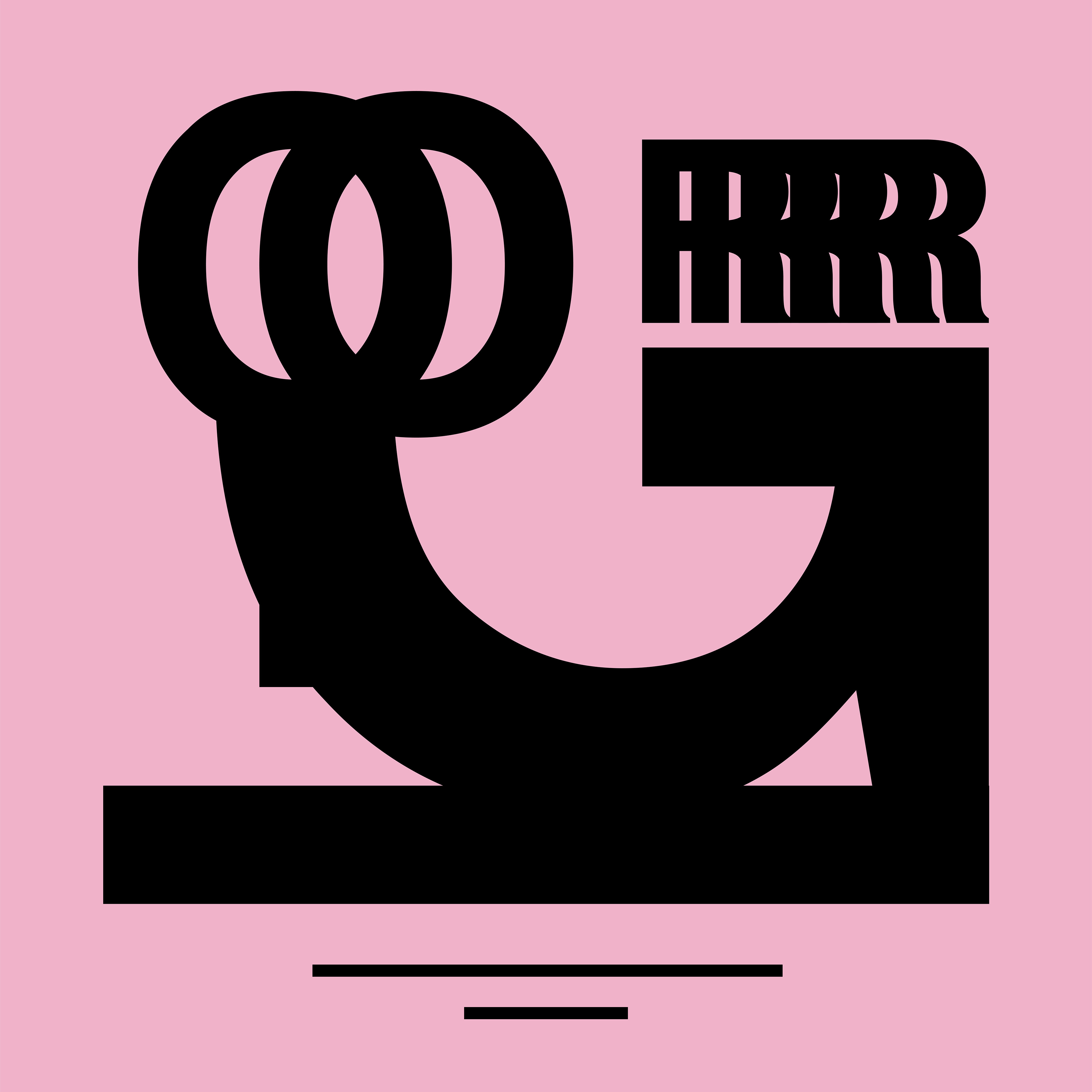
Layout (Igor)

Layout (Ye)
With my layouts all finished, I added a layer of plastic wrap over the album covers to give them more texture . Below is the final series:

Final (Blonde)

Final (Igor)

